|
I thought that I would do a personal reflection on my magazine. I really like how my magazine came out. I love the theme that I came up with and I love how it matches. I didn't like my project in the beginning because it seemed boring and not like me at all. As I revised things, I started making it more like me and made it more creative. It's still a little bland but it's still really good. My favorite part is the double page spread and that was also the part that I had the most fun making. I was also really nervous that I wasn't going to have fun making this magazine. I had once did a graphic design class and I did not like it because it was too technological for me. However, this was not what I thought it was. This was a really fun project and I had a lot of fun making it.
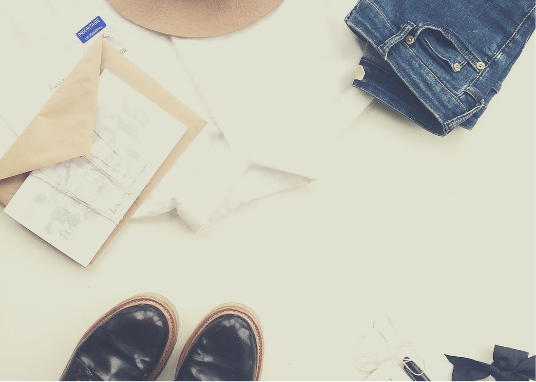
Note: The photos used for my Final Project are photos that I took myself.
0 Comments
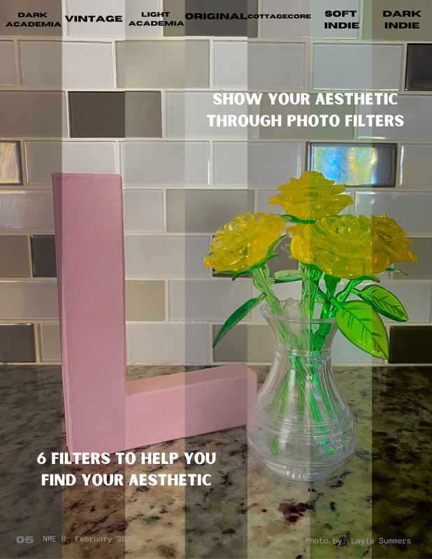
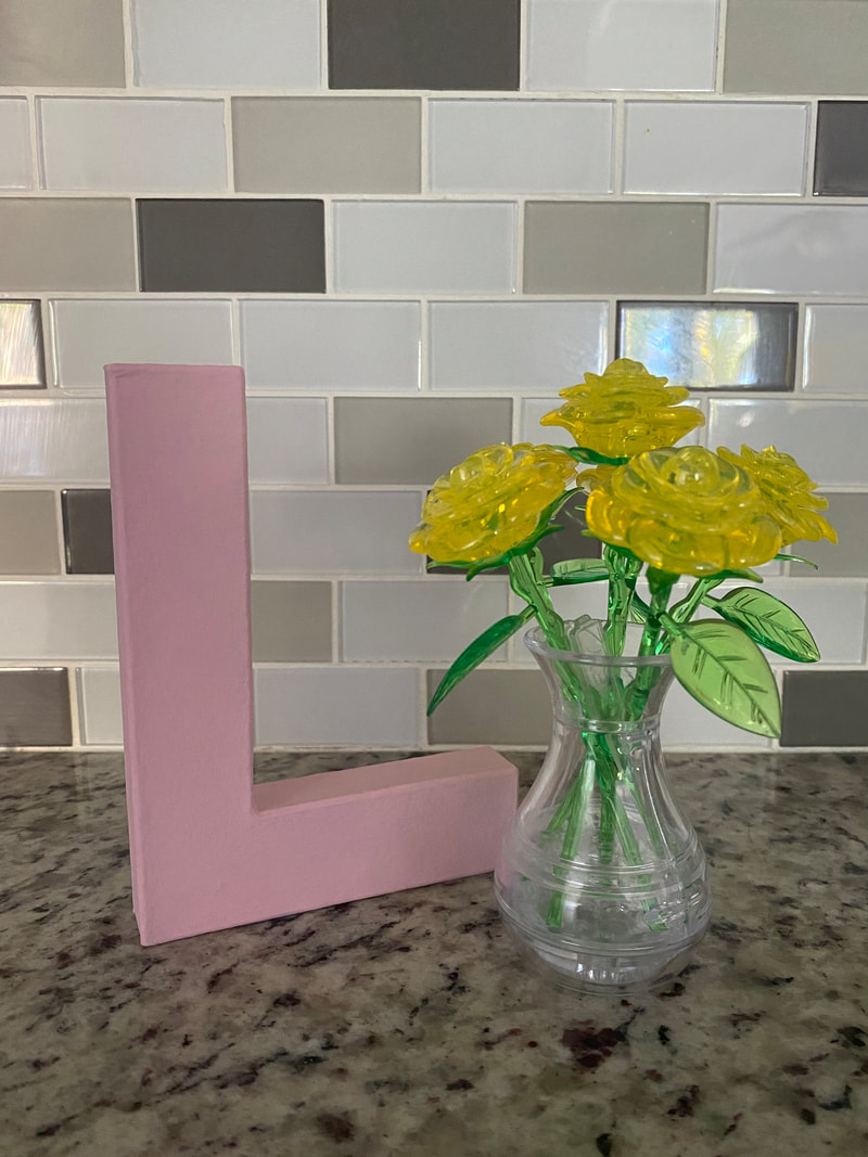
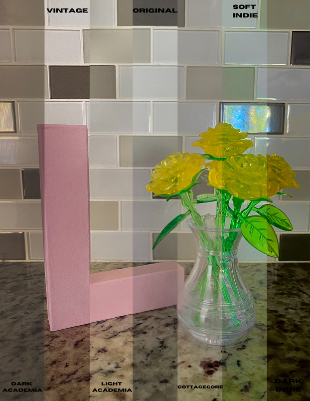
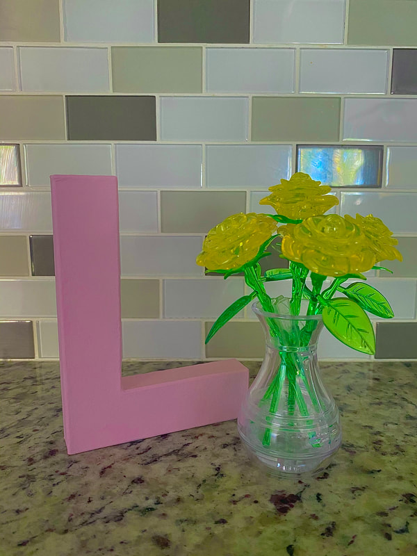
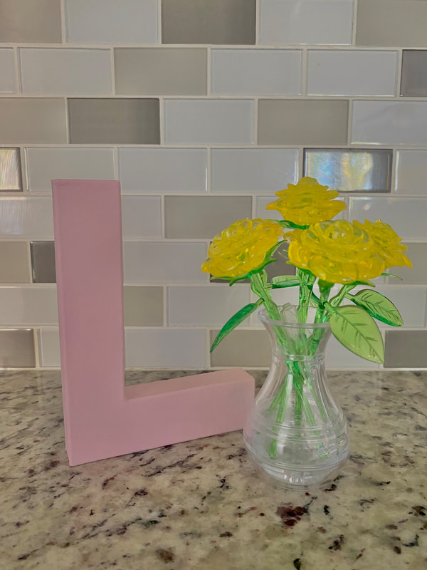
My favorite photo of my entire magazine is the photo that I used for my double page spread. I did not change my photo from the first to the final because I really liked it. I took the photo myself, and I edited them with the filters that my article is about. I put all of the photos together because I did not have enough room to put 7 photos on the pages to show the different filters. I just think that it would be important for the reader to see the different filters because that it what the article is about. There are 8 variations of the photo total, which are the original, the combined version, and the 6 filters.
Note: The photos used for the First Double Page Spread and the Final Double Page Spread are photos that I took myself. I finished my magazine and thought that I would explain the pictures that I used for my table of contents. I used a lot of stock photos because I didn't have the right photos, but the photos that I used in my final table of contents were taken by me First Table of Contents Photos:
These three photos are stock photos that I found on Canva. I did not have photos to put on the page. The photos I chose were photos that matched the articles that I put down on the paper. I didn't really like this version of the Table of Contents and it's partially because the photos don't seem to go together in my opinion Revised Table of Content Photos:
These three photos that I used are also stock photos that I found on Canva. The photos that I had did not seem to match the theme, so I used stock photos until I got photos that matched. Final Table of Content Photos:
These three photos I took myself. The one on the left is from when me and my family went outside to draw. It was after school and it helped with staring at a screen all day. The middle one is the same one that I used as my first magazine cover. I decided to still use it because it I liked it and it matched my theme but I didn't want it as my cover so I put it here. The last one is a picture of a sticker on the wall of my room. I used it because it matched the theme of my magazine and it matched the topic of my magazine. To make the picture match even more I used a filter from my filters article.
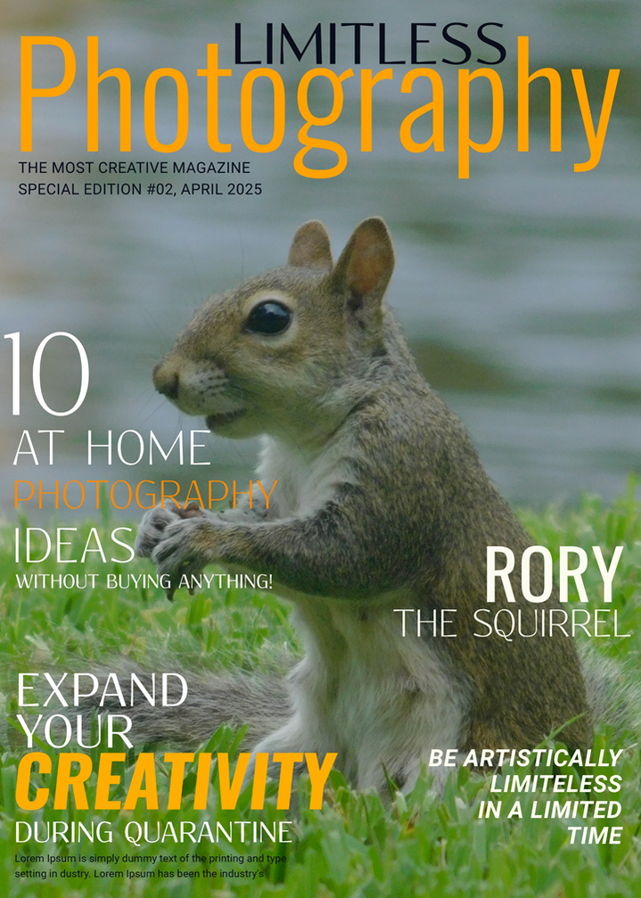
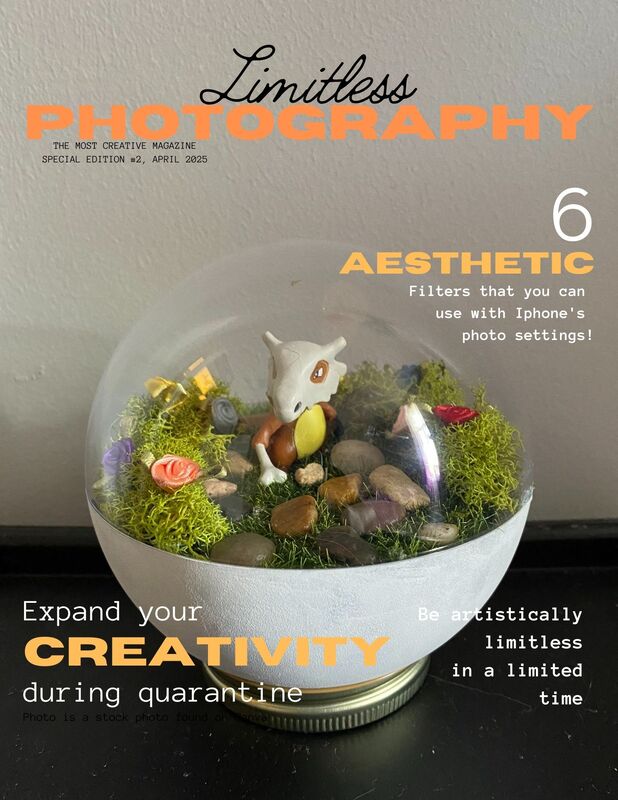
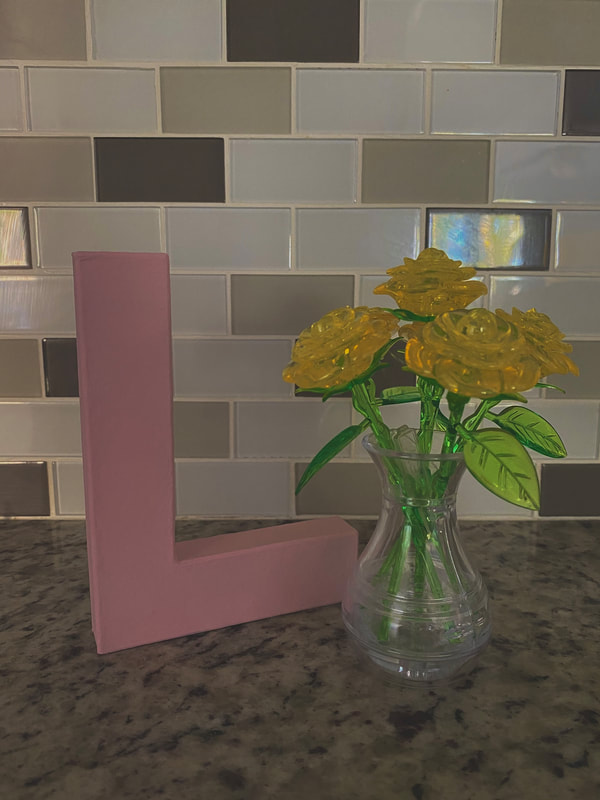
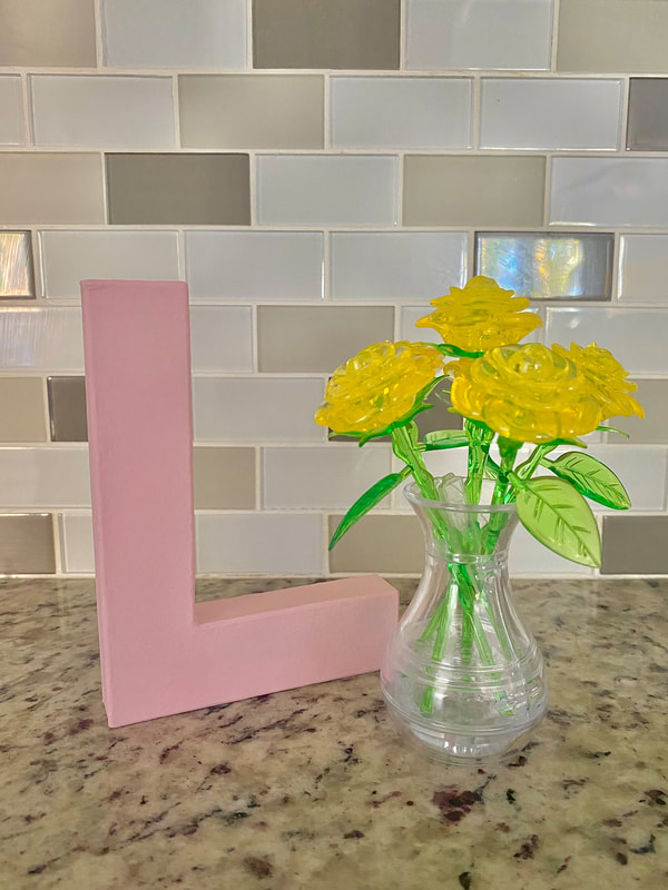
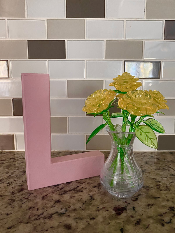
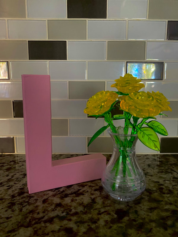
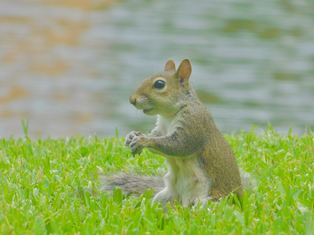
Note: The Photos That I Used for The First Table of Content and the Revised Table of Contents are stock photos that I found through Canva. The photos used for the Final Table of Contents are photos that I took myself. Now that my magazine project is completed, I thought that I would talk about the photos that used to make my project. This blog post is specifically about the photos that I used on my cover. I will be making more blog posts for the pictures used in my table of contents and the photos that I used for my double page spread. First Cover Photo: 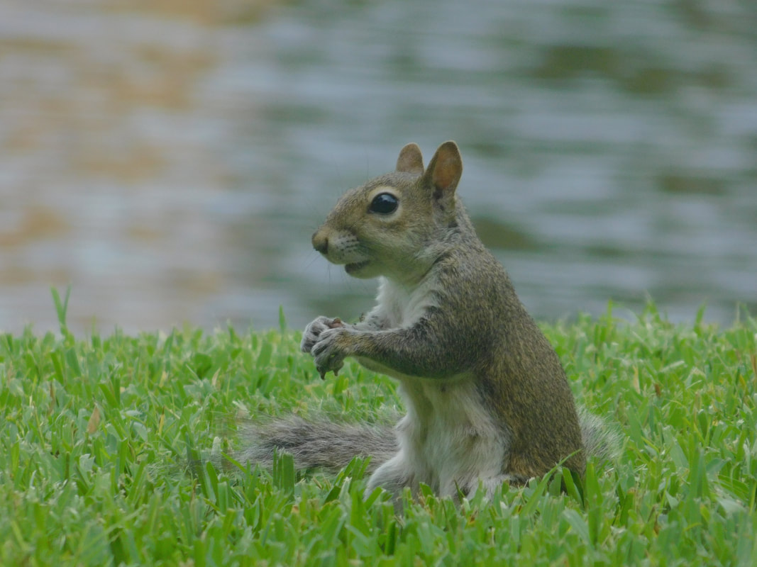 This photo I took at my old house in 2019. I used it as a filler picture because I didn't have any pictures for my magazine yet. The squirrel was in my backyard and I really wanted to take pictures because I was bored. Revised Cover Photo: 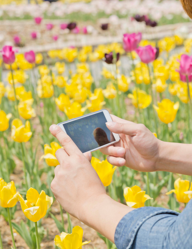 This photo is a stock photo that I found on Canva. I still didn't have a cover photo, but I wanted to make changes so I picked a photo that matched with my pink, orange, and yellow nature theme. It really helped me change a lot like the masthead, and the article titles and quotes. Final Cover Photo: 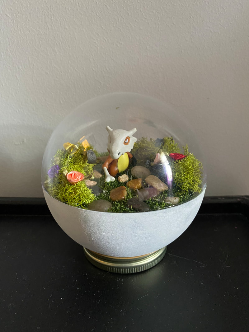 The final photo I took myself. I took it a few days before the project was due. I just thought that a cute terrarium would match the theme that I was going with. I was also something that I could easily find at home and it was DIY project so it's kind of a example of what I'm trying to convey with my magazine.
Note: The Photo that I used for the Revised Magazine Cover is a stock photo that I found through Canva. The photos used for the First Magazine Cover and the Final Magazine Covers are photos that I took myself. Question:
Discuss the issues raised in the targeting of national and local audience by international or global institutions Answer: One big conglomerate today is Disney. There many advantages that they have over independent media, like Amazon Studios. One of those advantages is that they have a lot more money than independent media. They are a huge company with a bunch of subcategories, which means that they have a big income. Disney’s large amount of money allows them to make higher quality films and products than independent films. Another advantage that Disney has over Amazon Studios is that they are more known, so they can reach a bigger audience faster. Disney is able to market a new film and it would spread like a wildfire throughout social media. There are also some disadvantages to Conglomerates like Disney. One is that the behavior of their sub-companies can reflect badly on the conglomerate. For example, if Marvel did something bad, that would negatively affect Disney’s image as well as Marvel’s One independent media outlet is Amazon Studios. One of the biggest advantages that independent media has is that they have more free-range in what they produce. They don’t have to make things specifically for what the audience likes, but also for themselves. One disadvantage and advantage is that Amazon Studios determines its own image. Independent media outlets don’t have sub-companies that can affect their reputation, so the way that their audience perceives them as a company all comes from how they act. If Amazon Studios were to produce something that was disrespectful to another person or culture, they would get negative feedback and would have no one to blame but themselves. If Amazon Studios were to produce something that brought awareness to an important issue, that would get them positive feedback. I love my double page spread. It inspired the entire theme for my magazine and helped me see how I wanted to organize everything. There aren't much changes from the first spread to the final spread. Most of the changes made were additions to fill in blank space. I added some quotes on the photo to fill the blank space on that side. One the other side, I just added more to the strip design to fill in the blank space of that page. The photo is a photo that I took at home. Like every other photo, I wanted to show what my magazine was about and give the readers examples of what they could do while stuck at home. The double page spread was the easiest part for me. I already knew what I wanted to do and making the layout was a really fun process. I didn't really need to do much for this part. First Double Page Spread:
Final Double Page Spread:
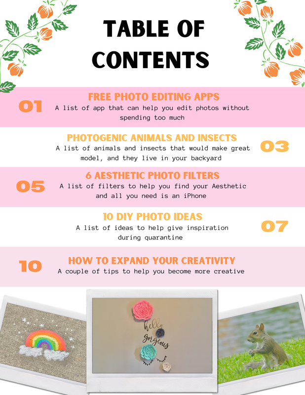
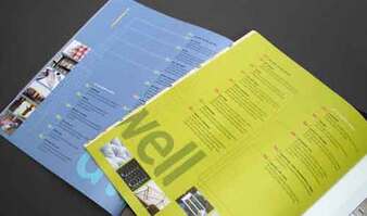
Note: Photos in these double page spreads are photos that I took myself. I finally finished my table of contents and it looks amazing. There is a lot of change from the first and final contents, but unlike my magazine cover, there are also a lot of changes from my second table of contents and my final table of contents. For my cover I used Photopea on the first cover, but I used Canva on my first table of contents instead. The theme of my table of contents is the same theme that I have throughout my magazine. It is nature and has the colors yellow, orange, and pink. I found my theme when doing my double page spread. My first cover and first table of contents did not match at all. The pictures that I used in my first and revised table of contents are stock images that I found on Canva. My final table of content pictures are all pictures that I took at home. I thought that it would be best to use at home pictures since that is what my magazine is about. I tried to have the pictures match my theme. I changed a lot of the placement from the first to the revised table of contents. I changes the colors and the fonts. I also changes the title "How to Get Little Kids to Take the Perfect Photo" to "6 Aesthetic Photo Filters". From the revised to the final table of contents, i changes the photo placement, added graphics at the top, changed the title font, and made the article title fonts smaller to fit the pictures on the page. I had a really difficult time trying to place the photos around the page. I keep feeling like it didn't match or it felt too crowded. Luckily found a placement that I like. Overall, I really like how my table of contents turned out. It was a fun process to go through.
Note: The Photos That I Used for The First Table of Content and the Revised Table of Contents are stock photos that I found through Canva. The photos used for the Final Table of Contents are photos that I took myself. We finally finished out magazine covers and in class and I could not be more happier with how mine came out. There are a lot of changes for my first cover to my final cover. My first cover didn't really have a theme. I was able to find a theme for my entire magazine when creating the double page spread. After finding that theme I applied it to my cover and table of contents. The color theme is orange, yellow, and pink. I wanted to use my own pictures for my magazine. The first and final covers are pictures that I took myself, and the middle is a stock photo that I found on Canva. Both of my personal photos i took while at home. It really helps show what my magazine is about and give great example for readers. The revision and final covers are completely different from the first and I think that is because I used a different program. For the first cover I used Photopea and for the other two I used Canva. Canva just really helped me be more creative with how I wanted my magazine to come out. My first cover just seems really basic and I wanted to make it more creative than it was and I think that I did that with my final cover. I didn't really change much from my second cover and my final cover, The fonts and word placement are almost the same. I did change the color of the bold words to a lighter orange to differentiate them from the magazine title.
Note: The Photo that I used for the Revised Magazine Cover is a stock photo that I found through Canva. The photos used for the First Magazine Cover and the Final Magazine Covers are photos that I took myself. I did not make a lot of changes between my first and second table of contents, but I made big differences that show two completely different styles. It's still a bit basic, but now it matches my cover and double page spread. On the second table of contents I added a stripe pattern to it, so that the titles would be easily separated. I also alternated the placement of the page numbers to make it not seem so boring. I used pink strips to fit the color scheme that I have for my magazine. I kept the titles. While I still have a lot of white space, there is not as much as there was before. Before:  After: 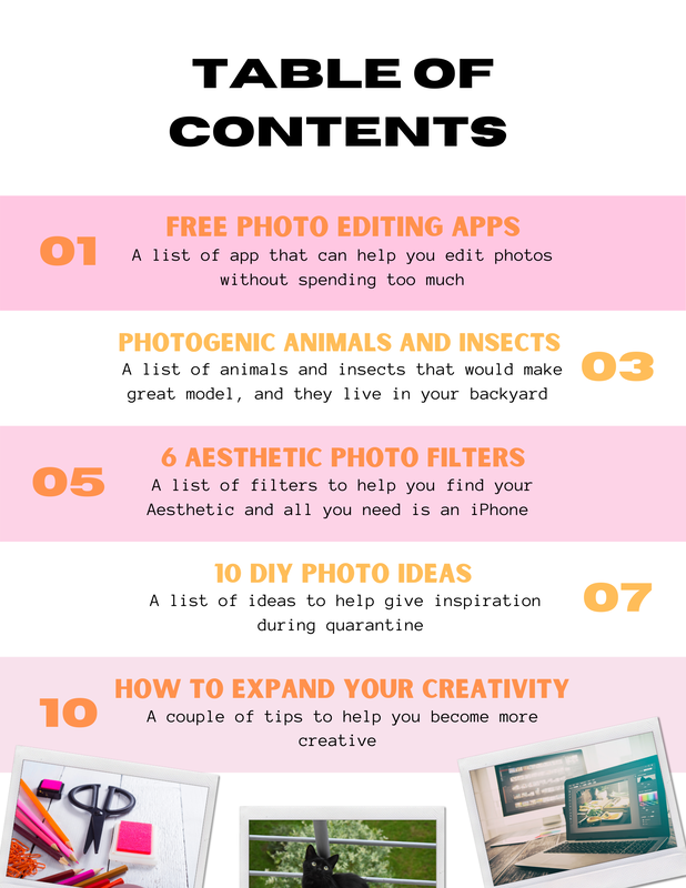 Note: The Photos That I Used for The First Table of Content and the Revised Table of Contents are stock photos that I found through Canva. Question/Task:
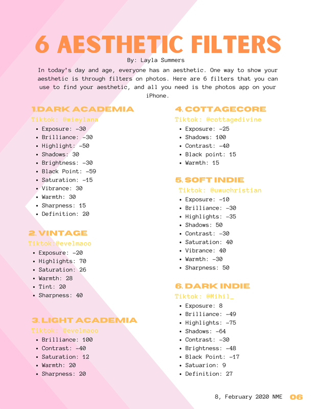
Discuss the ways in which the candidates' (this is you) own experiences of media consumption (how you use, access, and produce) illustrate wide patterns and trends in audience behavior. My Answer: The way that I consumer media is through technology, especially film. While many people still go watch films in theaters, a lot of people watch things on streaming services. Since we are in a pandemic, many people have relied on streaming services more because we can't go out to movie theaters anymore. Some streaming services also make movies and shows that can only be watch on their app. For instance, I've started watching WandaVision and I watched To All The Boys: Always and Forever, but they can only be found on Disney+ and Netflix. I don't go to the theater to watch movies. I wait for them to come out on an app so I can watch them at home. We are going back to the beginning and making changes to our magazine cover. I made a lot of changes. I kept the name of the magazine the same. I tried to make it match the double page spread. So the shade of orange was changed and so were the fonts. Because I changes the fonts I had to reposition the masthead. I also kept the "Expand your Creativity During Quarantine" and the "Be artistically limitless in this limited time". I changed the title "10 at home photography ideas without having to buy anything!" to the double page spread title "6 Aesthetic filters that you can use with IPhone's photo settings. I also moved it to the other side of the page. The biggest change that I made was the photo. I used a stock photo that I found on Canva, I don't know who made it, but I will be changing it to my own photo. The photo is close to something that I wanted to do for the cover and it matched my magazines color scheme. Before: 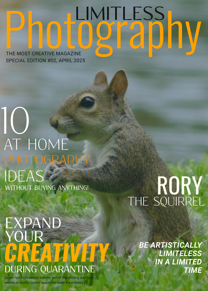 After: 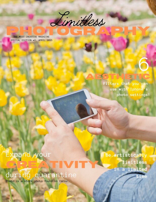 Note: The Photo that I used for the Revised Magazine Cover is a stock photo that I found through Canva. The photo used for the First Magazine Cover is a photo that I took myself. . I made the first draft for my double page spread. I made a lot of changes. On my table of contents I replaced the "How to Get Little Kids to Take Perfect Pictures" article with "6 Aesthetic Filters." I tried to stay with the color theme for this one. The fonts and format is different than the cover and the table of contents, but I like the style that I have for my article, so I will just edit the cover and table of contents. I originally was going to put 10 different filters, but I could not fit more than 6. I added the little triangle at the top of the second page because it looked plain without it. I also added all of the filters into one picture because I knew that there wouldn't be room for each column to show their own filter. The picture I did take. It is the first picture that I took specifically for this project. 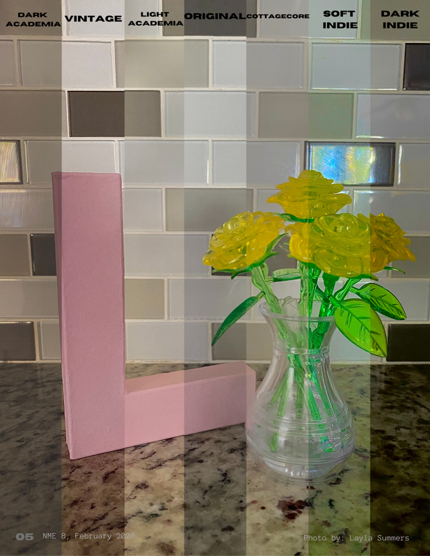 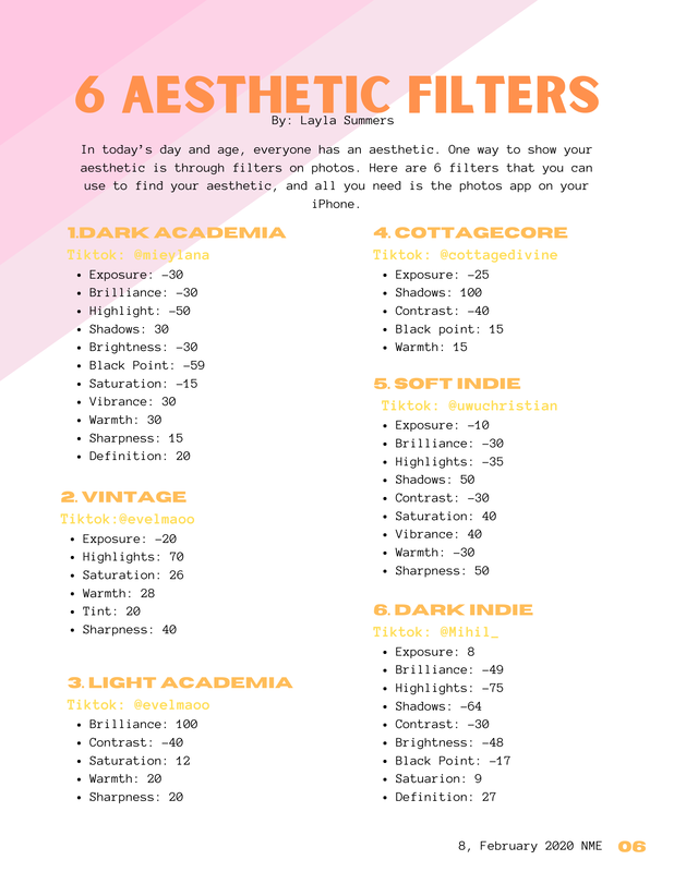 Note: Photos used in this double page spread are photos that I took myself. Question:
How did you integrate technologies - software, hardware, and online - in this project? My answer: I did not use many different types of technologies for this project. Almost everything is being done with a computer, and phone/camera. The main piece of hardware that I have been using is my computer. I use websites to put all of the pieces of my magazine together and to research stuff. There are many websites that I have used to put it together. I use Canva to design it and I use Photopea to help with the layout. The other pieces of hardware that I use are my phone and camera. I mainly use them to take pictures for my magazine. My main two-page spread is about filters that can be made using the IOS photos app. I use my phone to edit these pictures for that article to show the viewers what the filters look like. I transfer my photos to my computer so that I can add them to the magazine using Canva. This is my analysis of an article called Wyclef Jean 10 Commandments. This article is meant to help me when creating my article. My overall analysis of this article is that it is separated and clear. Everything goes together, and you can tell what type of article it is and who the article is about.
There is a paragraph dedicated to each tip. Jean explains each tip by giving a summary of how he learned them. Each paragraph is short and concise. Some elements separate the tips from one another. One element is the title of each paragraph. The titles of the paragraphs are bold and have a different font and font size than the summary part of the paragraph. Another element is that the numbers are used as drop caps. There are little spoilers or promos to what the article is about on both pages. On the first page with the picture of Wyclef Jean, there are two quotes from the article. Under the masthead, there is a sentence that explains what is being talked about in the article. The title of each paragraph gives the reader a little information on what each paragraph is about. There are three photos in the article. The picture on the first page is Wyclef Jean. This picture shows the reader who the article is about. The second picture and third picture show the readers a visual of something that jean references in the article. The second one is of Mick Jagger. The third is an album cover for the Synchronicity by The Police. The article makes it very obvious who it is about, which is Wyclef Jean. The first page is a picture of him, and his name is the masthead on the second page. On the second page, there is a list of albums that Jean recommends. It is in a grey rectangle to separate it from the main article. It has five paragraphs. Each paragraph is separated to tell the artist, the album, and a quote from Jean explaining why he made this recommendation. The artist is at the top of the paragraph in red and bolded. The song from the album is underneath the artist and is bolded. Jean's explanation is underneath the album name and is not in bold. Question:
How did your production skills develop throughout this project? My Answer: My production skills have improved a lot throughout this project. I learned many things about how films are put together and all of the different things that go into making a film or show. I learned a bunch of different camera angles for film and photography. I learned how to use Adobe InDesign, which is something that I never used before. I also learned how to format a magazine cover and how to make it eye-appealing and not too crowded. The most important thing that I think I learned is how to put film or print together for a specific audience. There is still a lot that I need to learn because I’m sure there are a lot more things that go into making print and film. Question:
How does your project engage with audiences and how would it be distributed as a real media text My Answer: My product engages with audiences by helping people find something to do or help people who are trying to find their interests. It helps people try photography in a way that doesn't get them so invested that if they are not passionate about it, they can easily change their mind. It also helps people find something to do while stuck at home. It also considers the people who may not have a lot of money to use the things the professionals use. It gives them an option of doing something that they love, or might love, at an affordable price. My product would be distributed digitally and physically so that I can reach more of my audience. For the physical copy of my magazine I would go to bookstores and try to make a deal to get them to sell my magazine. For the digital copy of my magazine I would post it on a website or a blog. To spread the word about my magazine, I would pay for advertisers on other websites. I would also make a social media account to help spread my magazine. Question :
How does your product use or challenge conventions and how does it represent socail groups or issues? My Answer: My cover does not challenge conventions and looks like every other magazine. This is because my magazine is meant to make photography easy and cheap for people. My article is meant for people who want to make photography a hobby or for people who want to become a professional photographer but are limited in equipment and money. My cover has a squirrel on it, which can easily be found in your backyard along with free apps that are on your phone. My product represents social issues because it helps people get through the pandemic that is currently happening. A lot of people are quarantining and they don’t have much to do. May magazine is meant to give tips on how to easily and cheaply get into photography as a hobby during this time. My cover represents that, by showing a picture of an animal found in a backyard, and with clear labels. This is my first table of contents. The pictures are temporary stock pictures, but the articles are some ideas that I have.
Note: The photos used in this table of contents are stock photos found through Canva. Example #1
Example #2
Example 3:
Extra Example
Does the TOC match your front page concept? These TOCs don't match my cover, however I am planning on making a lot of changes to my cover to make it look better. List of Possible Article Topics
 Title/Masthead: My masthead/title is Limitless Photography. It means that photography is limitless. It suggests that my magazine is about how to come up with ideas for photographs.
Typography: The mood that is suggested by the shape, color, size, and arrangement of letters is calm and organized. Certain words were bigger and in a different color because they were meant to pop out. Image: The picture that was selected as a picture that I took of a squirrel. I had it pop out by making the most of the words white. It was shot from the same level as the squirrel to make it a medium shot. The animal is doing what it would naturally do when it’s not being watched. It addresses the reader because it is an animal that can be seen in your backyard, which ties in with the theme of trying to take photos while stuck at home. Language: My strapline is “Be artistically limitless in a limited time”. The strapline suggests that the magazine is meant to help people get inspired and be creative and that the reader needs a little bit of inspiration. Some rhetorical features that are evident in the coverline are the colors that differentiate what’s important and the size that emphasizes the importance of something. The most notable linguistic features of the editorial and the articles “10”, “Photography”, and “creativity”. Note: The photo used in this cover is a photo that I took myself. |
DescriptionThis blog was created for a AICE Media Studies class. This section of the blog is my progress for the final project. Archives
April 2021
Categories |
 RSS Feed
