|
I did not make a lot of changes between my first and second table of contents, but I made big differences that show two completely different styles. It's still a bit basic, but now it matches my cover and double page spread. On the second table of contents I added a stripe pattern to it, so that the titles would be easily separated. I also alternated the placement of the page numbers to make it not seem so boring. I used pink strips to fit the color scheme that I have for my magazine. I kept the titles. While I still have a lot of white space, there is not as much as there was before. Before: 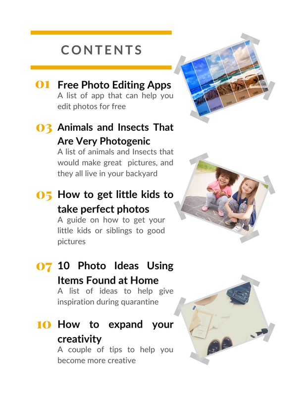 After: 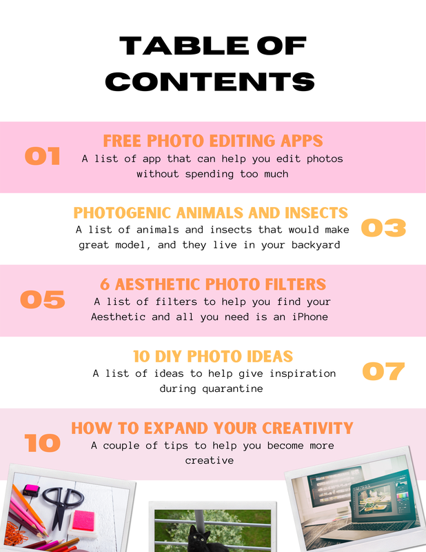 Note: The Photos That I Used for The First Table of Content and the Revised Table of Contents are stock photos that I found through Canva.
0 Comments
Leave a Reply. |
DescriptionThis blog was created for a AICE Media Studies class. This section of the blog is my progress for the final project. Archives
April 2021
Categories |
 RSS Feed
