|
Question/Task:
Discuss the ways in which the candidates' (this is you) own experiences of media consumption (how you use, access, and produce) illustrate wide patterns and trends in audience behavior. My Answer: The way that I consumer media is through technology, especially film. While many people still go watch films in theaters, a lot of people watch things on streaming services. Since we are in a pandemic, many people have relied on streaming services more because we can't go out to movie theaters anymore. Some streaming services also make movies and shows that can only be watch on their app. For instance, I've started watching WandaVision and I watched To All The Boys: Always and Forever, but they can only be found on Disney+ and Netflix. I don't go to the theater to watch movies. I wait for them to come out on an app so I can watch them at home.
0 Comments
We are going back to the beginning and making changes to our magazine cover. I made a lot of changes. I kept the name of the magazine the same. I tried to make it match the double page spread. So the shade of orange was changed and so were the fonts. Because I changes the fonts I had to reposition the masthead. I also kept the "Expand your Creativity During Quarantine" and the "Be artistically limitless in this limited time". I changed the title "10 at home photography ideas without having to buy anything!" to the double page spread title "6 Aesthetic filters that you can use with IPhone's photo settings. I also moved it to the other side of the page. The biggest change that I made was the photo. I used a stock photo that I found on Canva, I don't know who made it, but I will be changing it to my own photo. The photo is close to something that I wanted to do for the cover and it matched my magazines color scheme. Before: 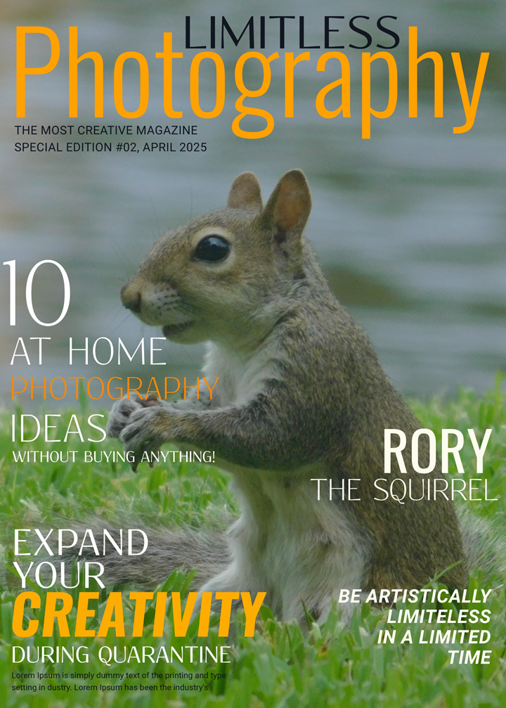 After: 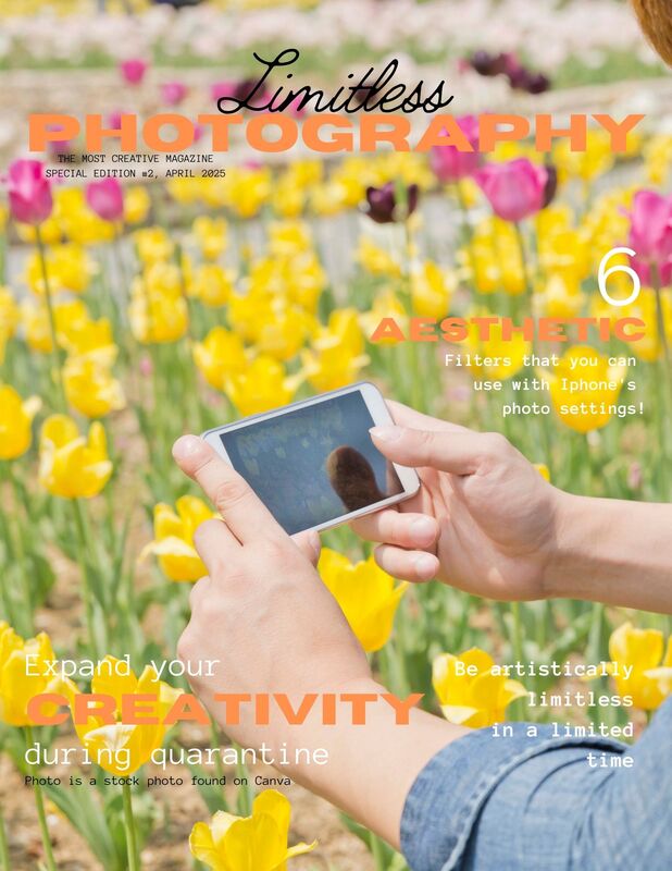 Note: The Photo that I used for the Revised Magazine Cover is a stock photo that I found through Canva. The photo used for the First Magazine Cover is a photo that I took myself. . I made the first draft for my double page spread. I made a lot of changes. On my table of contents I replaced the "How to Get Little Kids to Take Perfect Pictures" article with "6 Aesthetic Filters." I tried to stay with the color theme for this one. The fonts and format is different than the cover and the table of contents, but I like the style that I have for my article, so I will just edit the cover and table of contents. I originally was going to put 10 different filters, but I could not fit more than 6. I added the little triangle at the top of the second page because it looked plain without it. I also added all of the filters into one picture because I knew that there wouldn't be room for each column to show their own filter. The picture I did take. It is the first picture that I took specifically for this project. 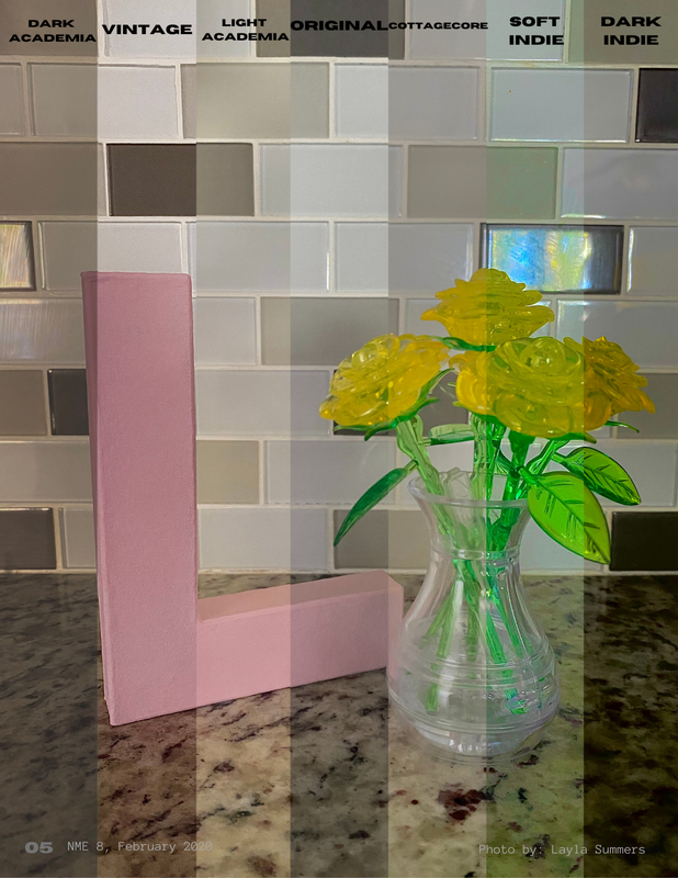 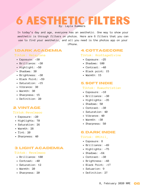 Note: Photos used in this double page spread are photos that I took myself. Question:
How did you integrate technologies - software, hardware, and online - in this project? My answer: I did not use many different types of technologies for this project. Almost everything is being done with a computer, and phone/camera. The main piece of hardware that I have been using is my computer. I use websites to put all of the pieces of my magazine together and to research stuff. There are many websites that I have used to put it together. I use Canva to design it and I use Photopea to help with the layout. The other pieces of hardware that I use are my phone and camera. I mainly use them to take pictures for my magazine. My main two-page spread is about filters that can be made using the IOS photos app. I use my phone to edit these pictures for that article to show the viewers what the filters look like. I transfer my photos to my computer so that I can add them to the magazine using Canva. This is my analysis of an article called Wyclef Jean 10 Commandments. This article is meant to help me when creating my article. My overall analysis of this article is that it is separated and clear. Everything goes together, and you can tell what type of article it is and who the article is about.
There is a paragraph dedicated to each tip. Jean explains each tip by giving a summary of how he learned them. Each paragraph is short and concise. Some elements separate the tips from one another. One element is the title of each paragraph. The titles of the paragraphs are bold and have a different font and font size than the summary part of the paragraph. Another element is that the numbers are used as drop caps. There are little spoilers or promos to what the article is about on both pages. On the first page with the picture of Wyclef Jean, there are two quotes from the article. Under the masthead, there is a sentence that explains what is being talked about in the article. The title of each paragraph gives the reader a little information on what each paragraph is about. There are three photos in the article. The picture on the first page is Wyclef Jean. This picture shows the reader who the article is about. The second picture and third picture show the readers a visual of something that jean references in the article. The second one is of Mick Jagger. The third is an album cover for the Synchronicity by The Police. The article makes it very obvious who it is about, which is Wyclef Jean. The first page is a picture of him, and his name is the masthead on the second page. On the second page, there is a list of albums that Jean recommends. It is in a grey rectangle to separate it from the main article. It has five paragraphs. Each paragraph is separated to tell the artist, the album, and a quote from Jean explaining why he made this recommendation. The artist is at the top of the paragraph in red and bolded. The song from the album is underneath the artist and is bolded. Jean's explanation is underneath the album name and is not in bold. Question:
How did your production skills develop throughout this project? My Answer: My production skills have improved a lot throughout this project. I learned many things about how films are put together and all of the different things that go into making a film or show. I learned a bunch of different camera angles for film and photography. I learned how to use Adobe InDesign, which is something that I never used before. I also learned how to format a magazine cover and how to make it eye-appealing and not too crowded. The most important thing that I think I learned is how to put film or print together for a specific audience. There is still a lot that I need to learn because I’m sure there are a lot more things that go into making print and film. |
DescriptionThis blog was created for a AICE Media Studies class. This section of the blog is my progress for the final project. Archives
April 2021
Categories |
 RSS Feed
