|
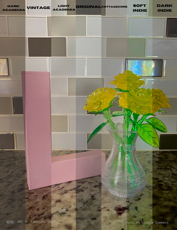
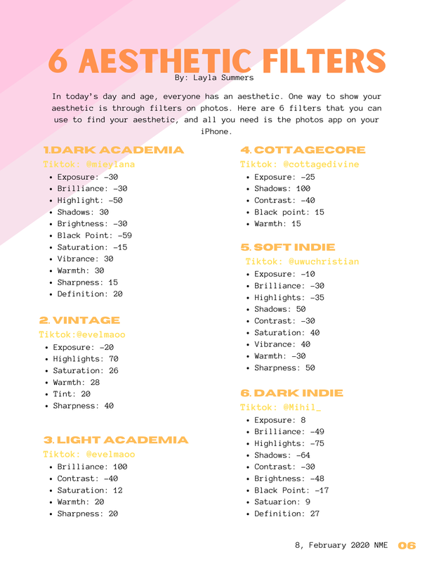
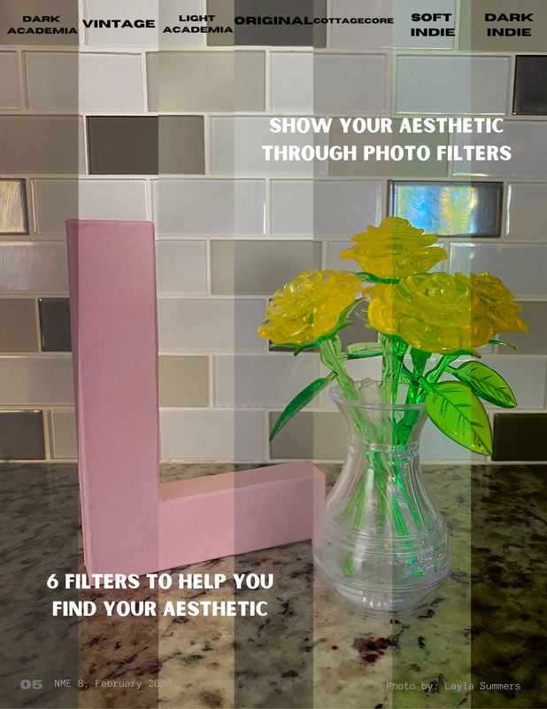
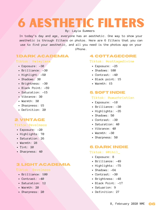
I love my double page spread. It inspired the entire theme for my magazine and helped me see how I wanted to organize everything. There aren't much changes from the first spread to the final spread. Most of the changes made were additions to fill in blank space. I added some quotes on the photo to fill the blank space on that side. One the other side, I just added more to the strip design to fill in the blank space of that page. The photo is a photo that I took at home. Like every other photo, I wanted to show what my magazine was about and give the readers examples of what they could do while stuck at home. The double page spread was the easiest part for me. I already knew what I wanted to do and making the layout was a really fun process. I didn't really need to do much for this part. First Double Page Spread:
Final Double Page Spread:
Note: Photos in these double page spreads are photos that I took myself.
0 Comments
Leave a Reply. |
DescriptionThis blog was created for a AICE Media Studies class. This section of the blog is my progress for the final project. Archives
April 2021
Categories |
 RSS Feed
